AKAI MPK mini 4
Not long ago, I went searching through a set of documents from my university years, carefully stored in my studio for decades. Among them, I discovered a rich collection of historic product brochures for electronic musical instruments, originally gathered for my diploma project “Gambit.” Many of these date back to the early and late 1980s and now feel almost museum-worthy.
After only a few pages, I found myself absorbed in the vivid photography and in the sometimes charmingly overstated marketing language of that era — paging through the material for hours, as if traveling through a time capsule. At the very end of the folder, I came across my original application letters — typed on my mother’s typewriter while I was still working on my diploma presentation drawings. I sent those letters all over the world: to nearly every well-known synthesizer manufacturer in the United States, Japan, Australia (you know which one …), and the few we had here in Europe. Altogether, more than fifteen letters. Not a single reply.

And yet, the story took a delightful turn. Today, with Hartmann Design, we are fortunate to count nearly all of those once-contacted companies among our valued clients — including, more recently, the legendary brand Akai.
As far as I know, the Akai MPK mini is the best-selling keyboard worldwide. In summer 2024, we had the honor of re-imagining this compact, energetic instrument. We began by bringing the previous generation — the mini mk3 — into our studio for analysis, and we were genuinely impressed. For its category, it revealed a remarkably mature product concept with a robust, almost “American” design character.
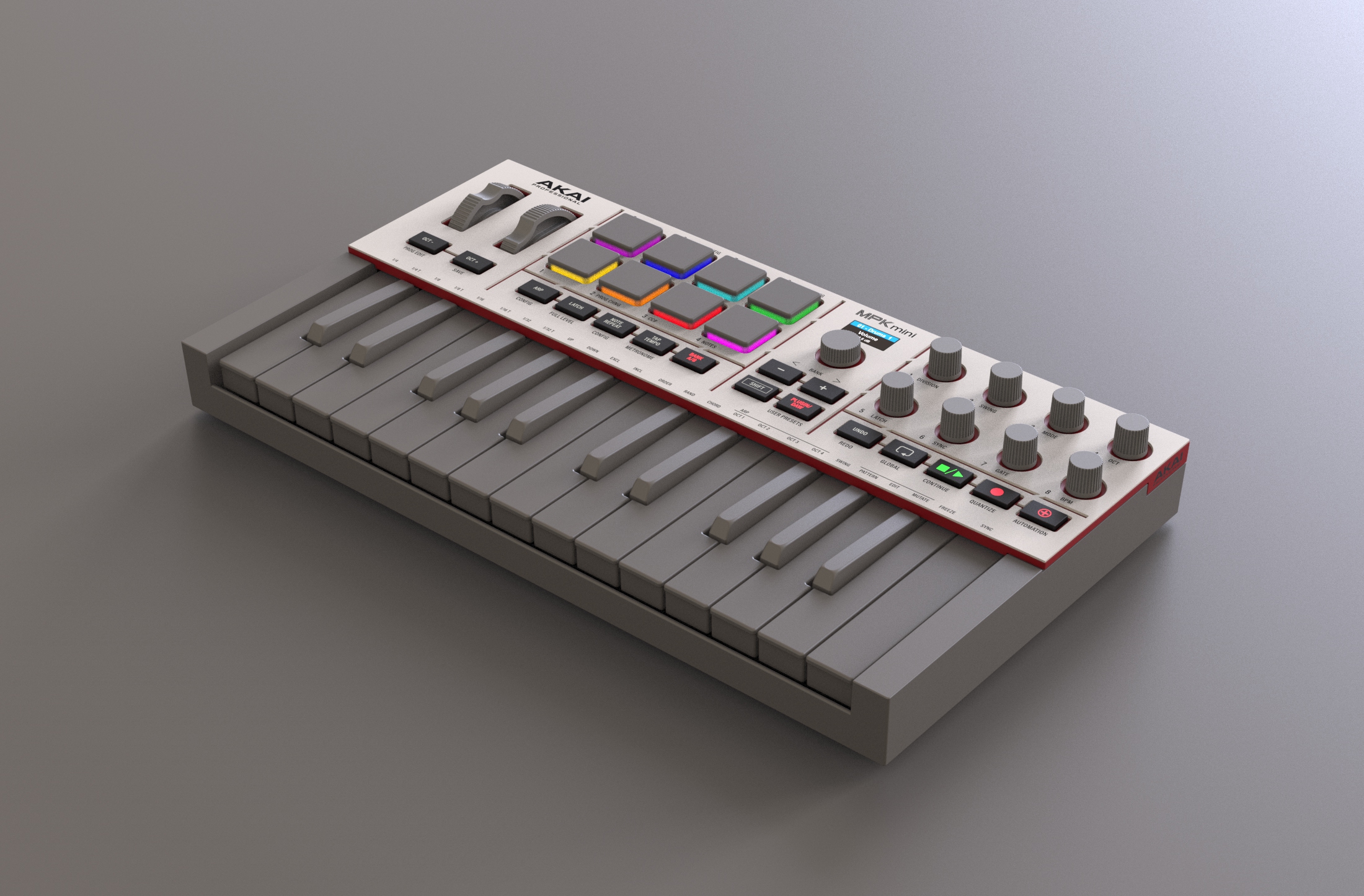
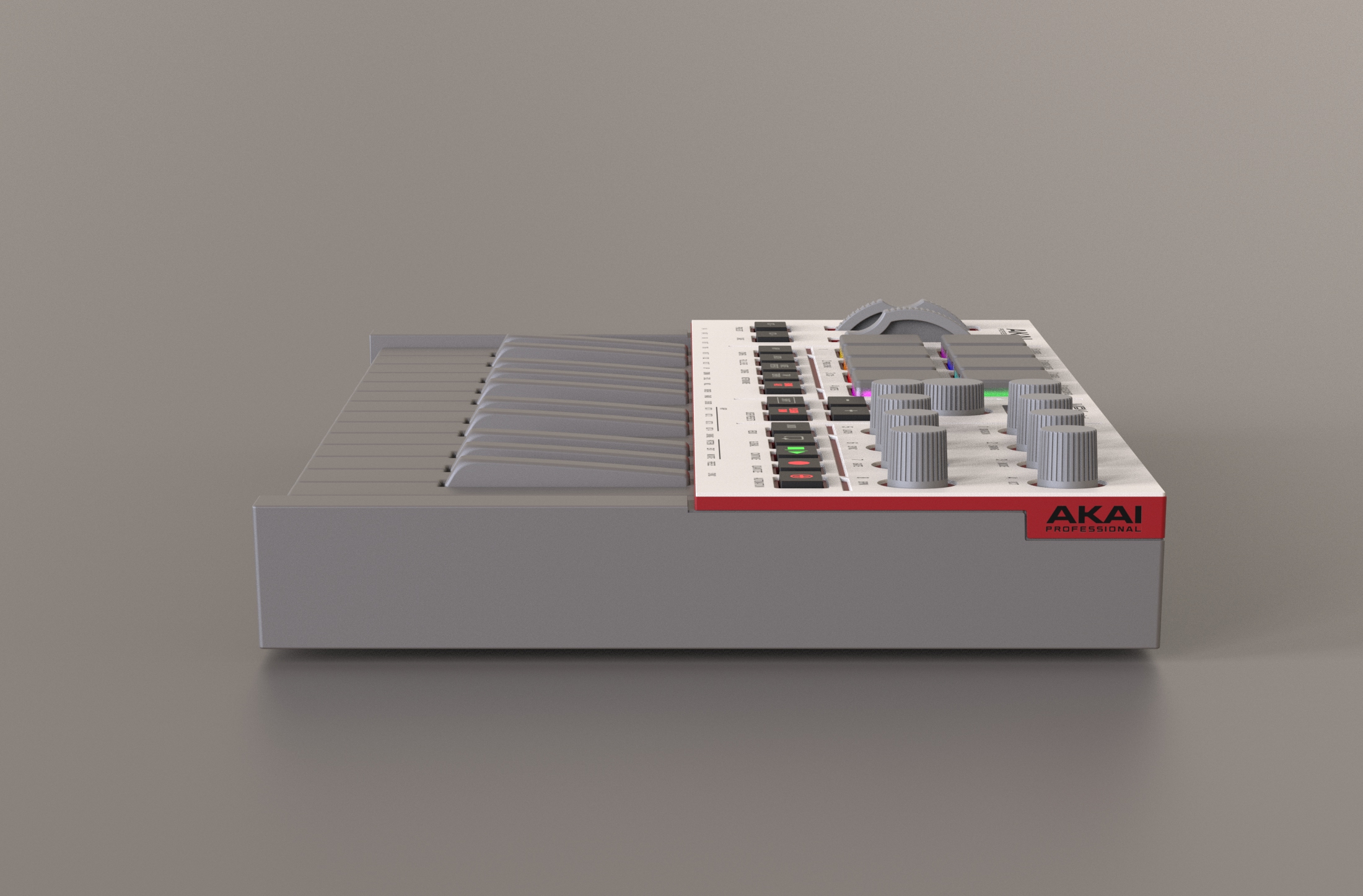
What felt less convincing, with all due respect, was a slightly toy-like impression — primarily caused by the extensive use of red plastic on the prominent side elements. Of course, red is an essential part of the Akai identity; however, to achieve a more confident and professional presence, we chose to express this signature color with greater restraint and refinement.
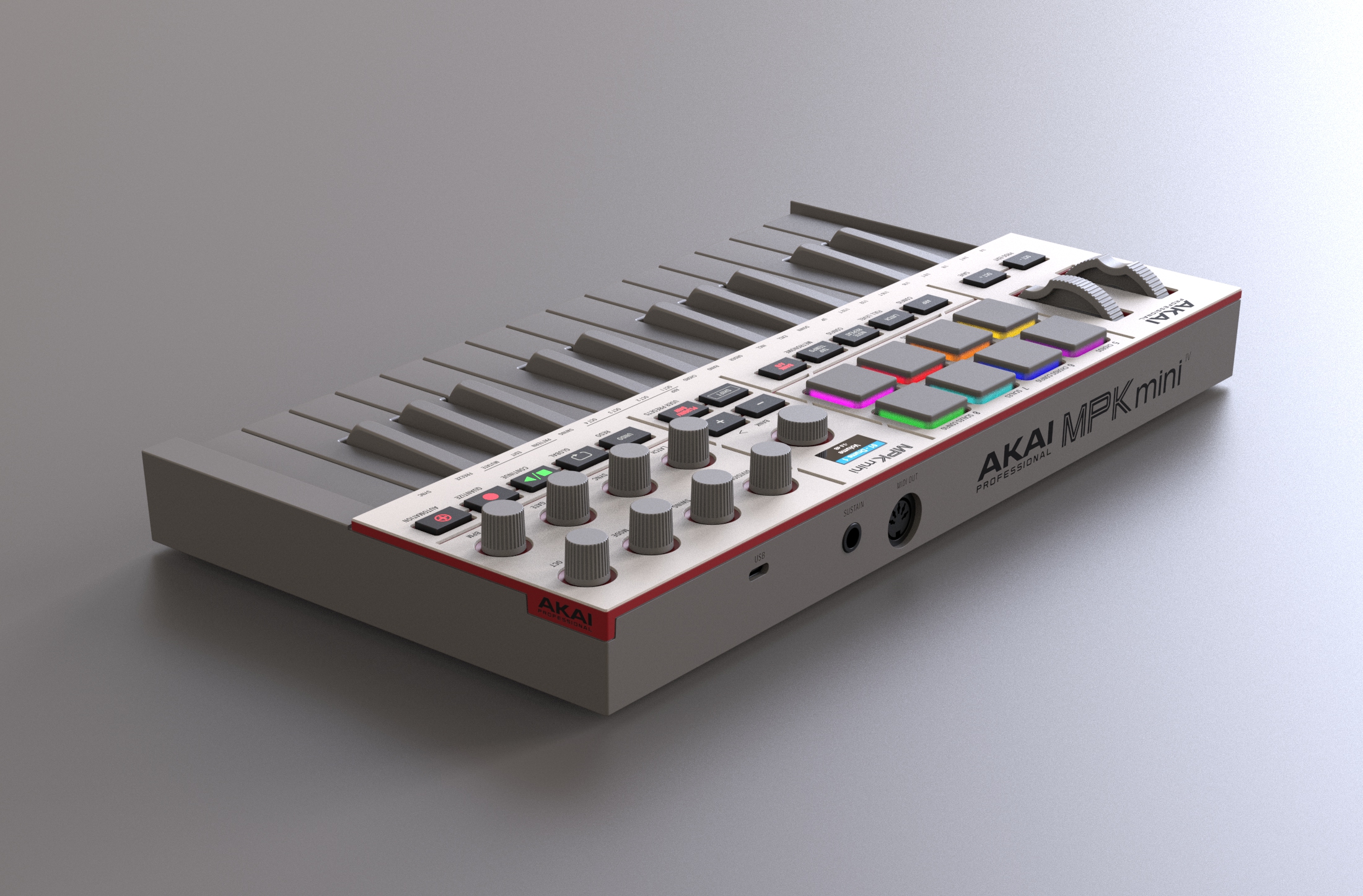
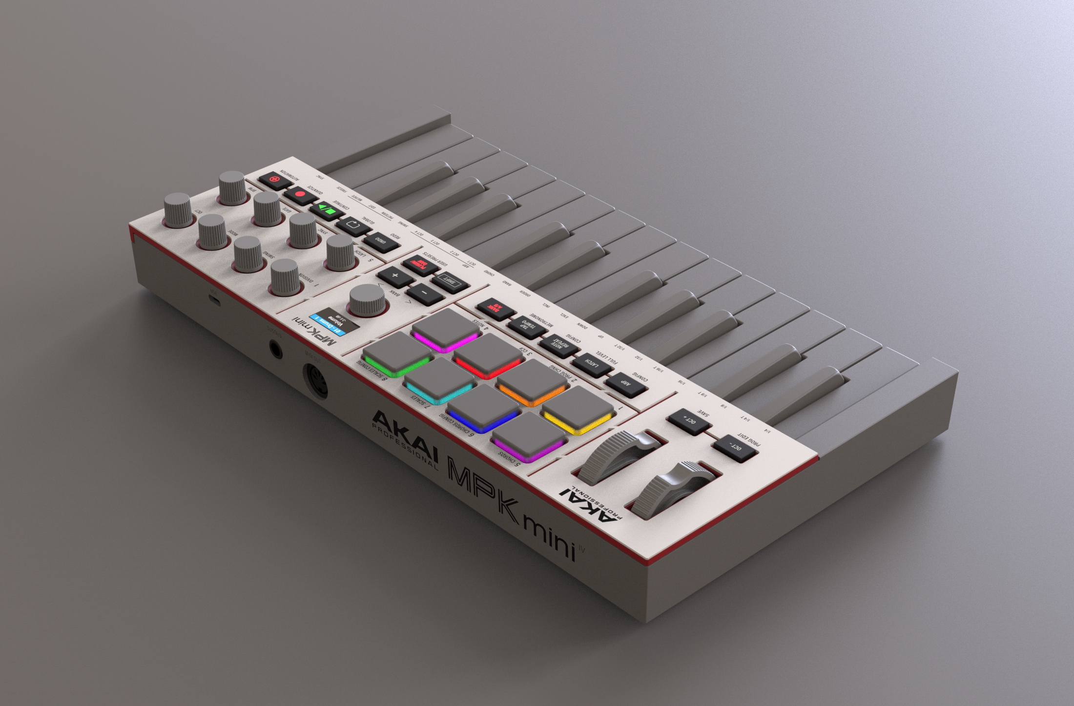
Our design language consciously reconnects with Akai’s golden era, when — in the early 1990s — the brand’s groundbreaking samplers could be found in almost every serious studio worldwide. These instruments not only shaped the sound of their time, but were also visually unmistakable thanks to their iconic off-white appearance.
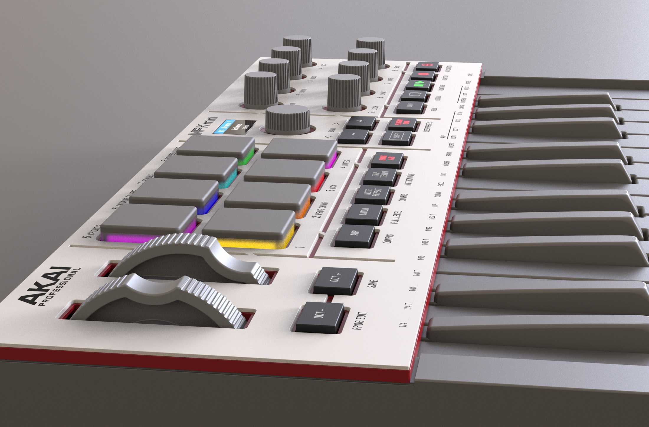
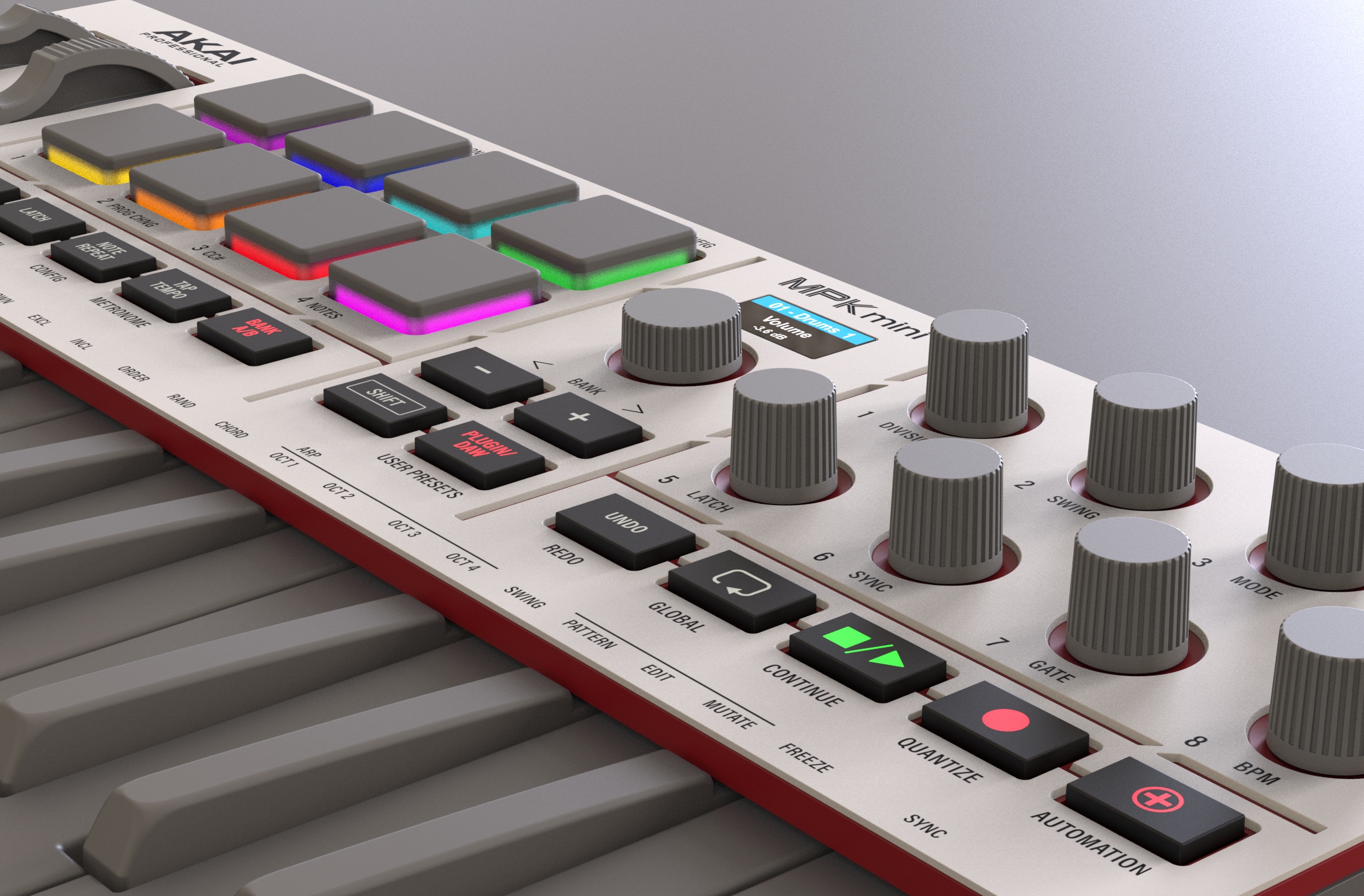
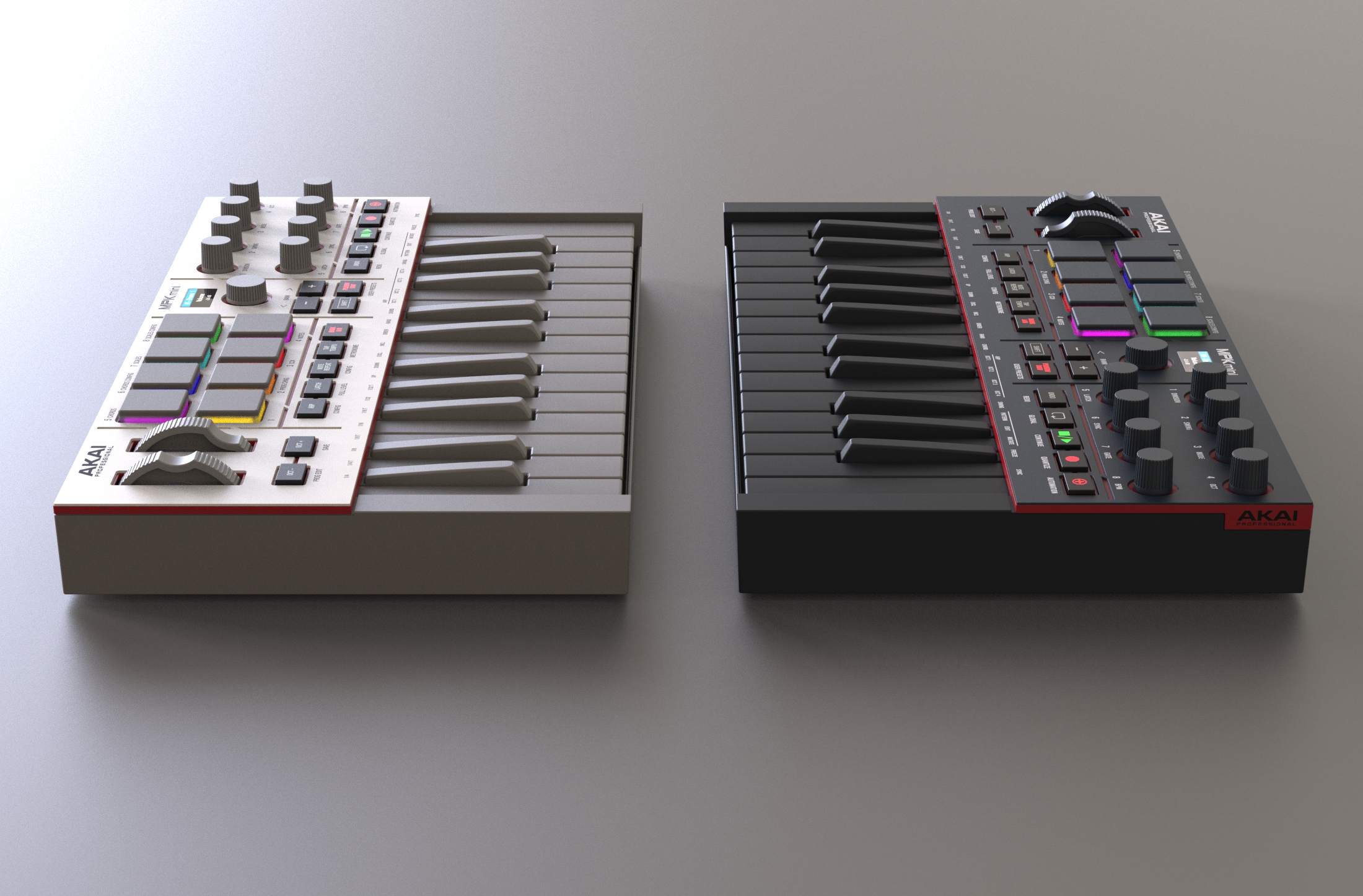
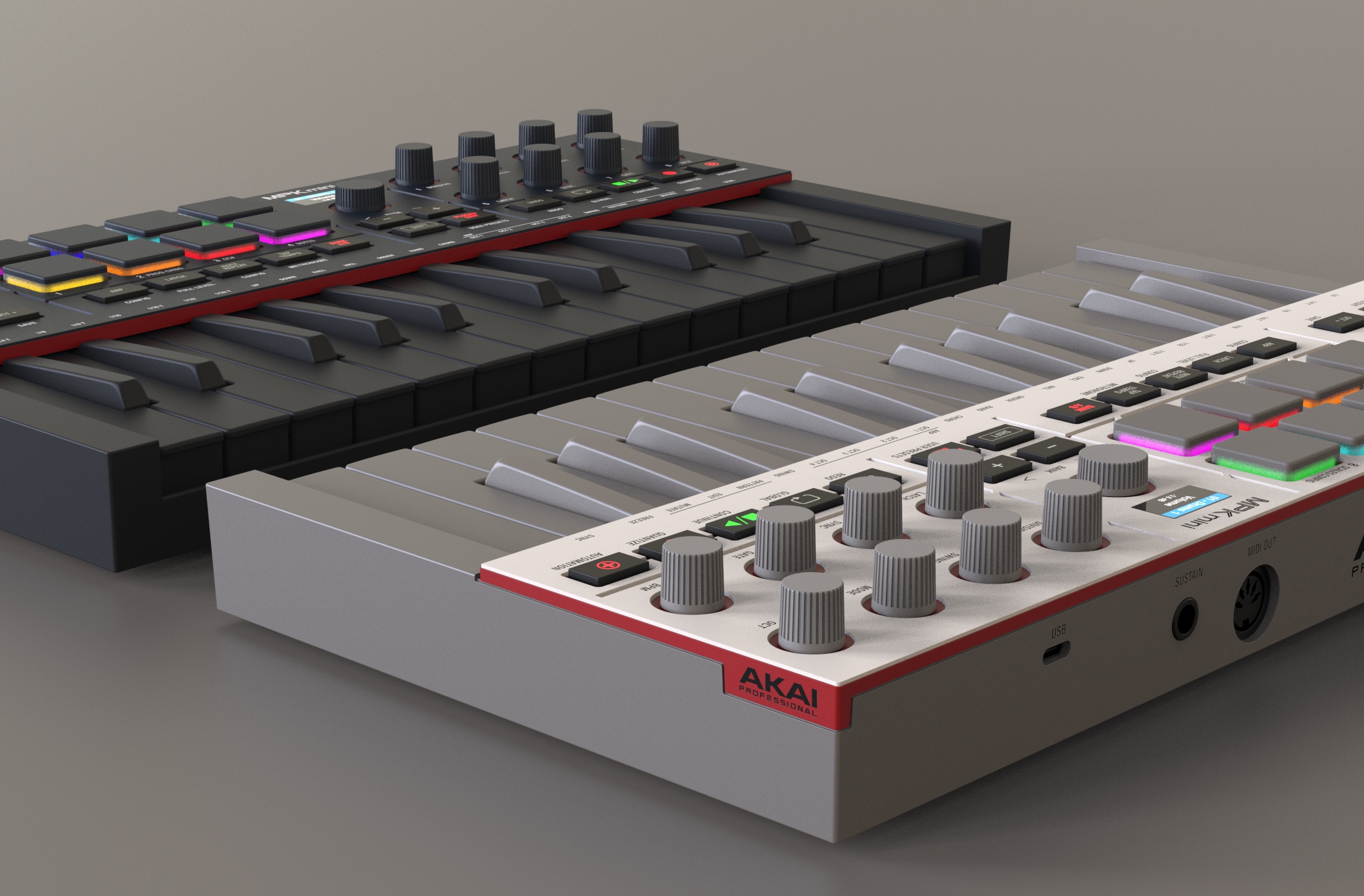
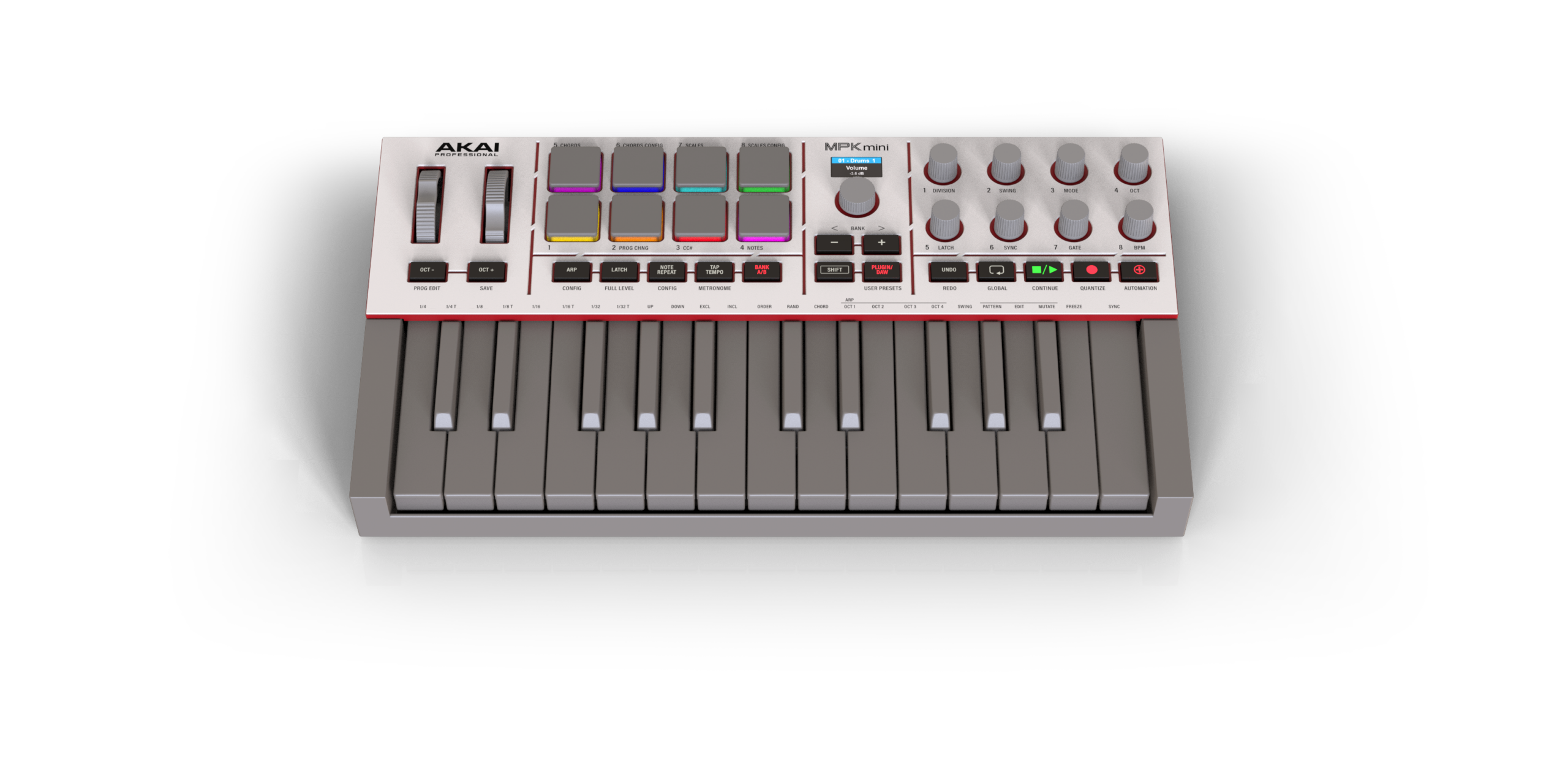
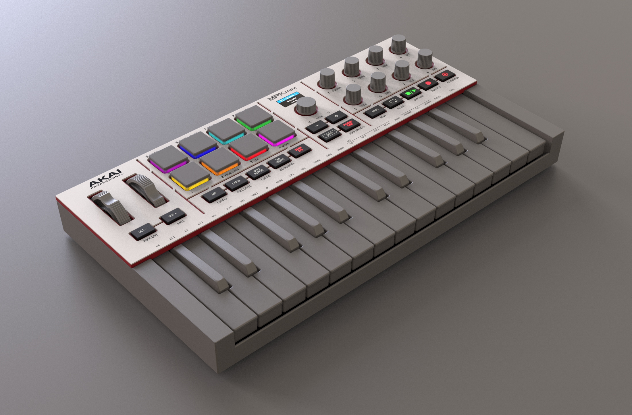
Our reinterpretation carries this heritage forward in a contemporary, more mature expression. A three-dimensionally structured top panel organizes functional areas with clarity and precision. Carefully introduced form-slits reveal subtle accents of the signature Akai red: a two-layer sandwich beneath the surface creates fine, atmospheric color edges that continue behind the keyboard, forming a calm visual statement.
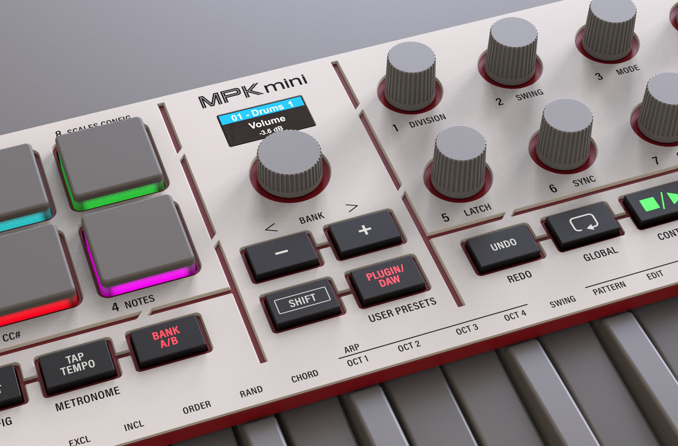
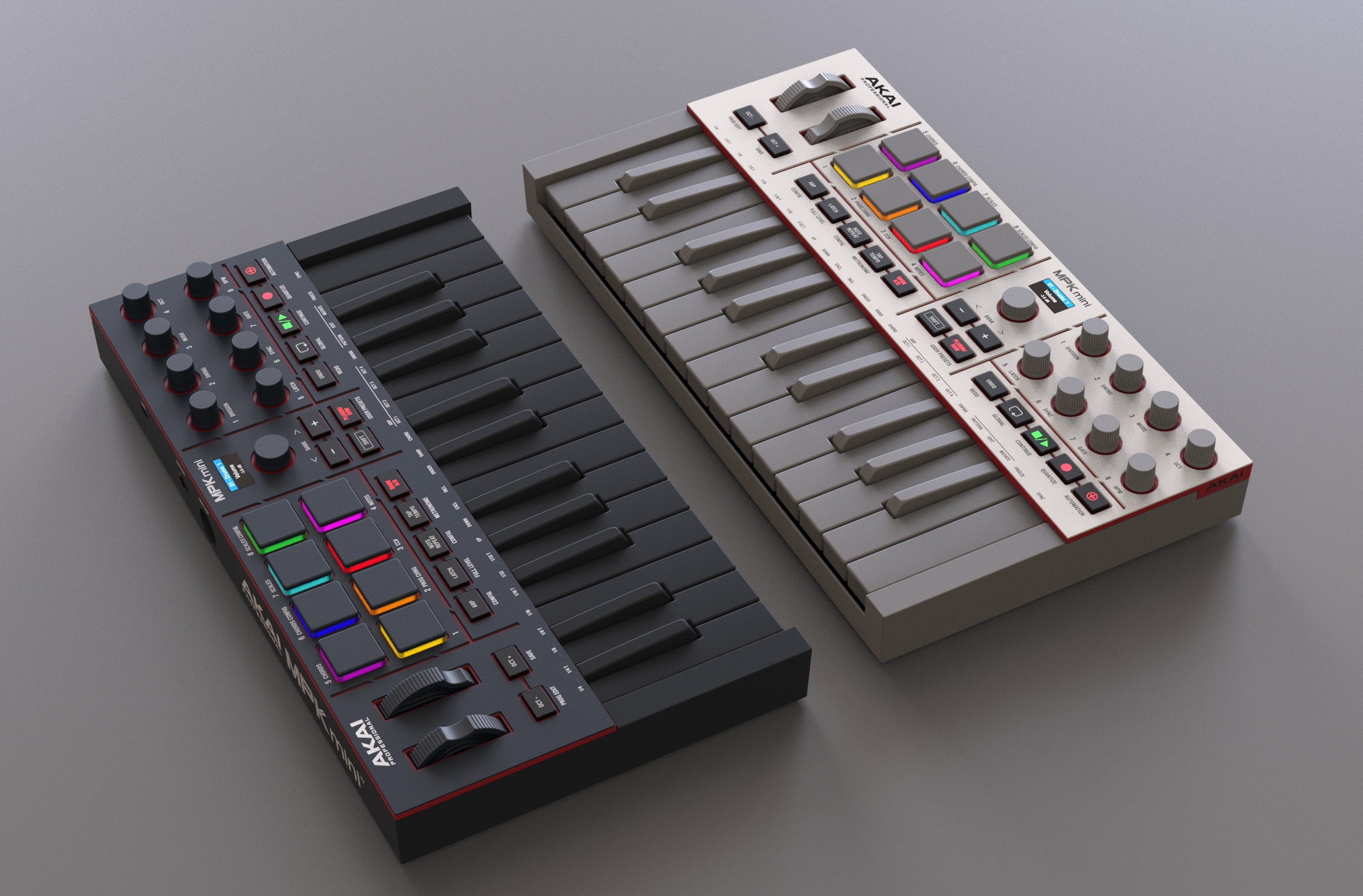
The restrained colorways — Akai Grey and Black — establish an elegant stage for the backlit pads and buttons. The brand name appears confidently, yet without excess, on the right side of the enclosure within a red “pixel block,” reinforcing the modern, block-based product architecture.
